25 Unforgettable Kids Movie Poster Mistakes
Table of Contents
These hilarious movie poster mistakes can range from small editing errors to especially glaring placements.
You Are Reading :25 Unforgettable Kids Movie Poster Mistakes
Who remembers the first time Tobey Maguire’s Spider-Man first graced posters in the cinema? Do you recall how excited you were to see that movie? Sometimes we glance at posters, but don’t really spend time to actually look. If you study them carefully, though, it turns out that a lot of movie posters have some issues. In fact, you’d be surprised at how many mistakes you can find in posters of even the most sensational movies.
These mistakes can range from small editing errors to especially glaring placements. On some occasions, they’re just posters that serve to confuse people about what the movie is about. Regardless of which is which, as kids, we probably had no clue what constituted a good or bad movie poster. In fact, we were probably more interested in just letting our imaginations go wild with the next big family film on the market. It makes sense, that we begin to see the movie posters we grew up with through rose-tinted glasses.
With this in mind, why don’t we talk a little bit about the kids movies of the past? Back when we had so much free time, rewatching Pokemon: The First Movie on the old VCD player was probably all we could do. Have you ever wondered whether that movie you adored so much also had a poster up to snuff? I hope you’re ready because what you see, you won’t be able to unsee.
In any case, here are 25 unforgettable kids movie mistakes that you probably grew up with but never realized.
25 Spider-Man: Homecoming
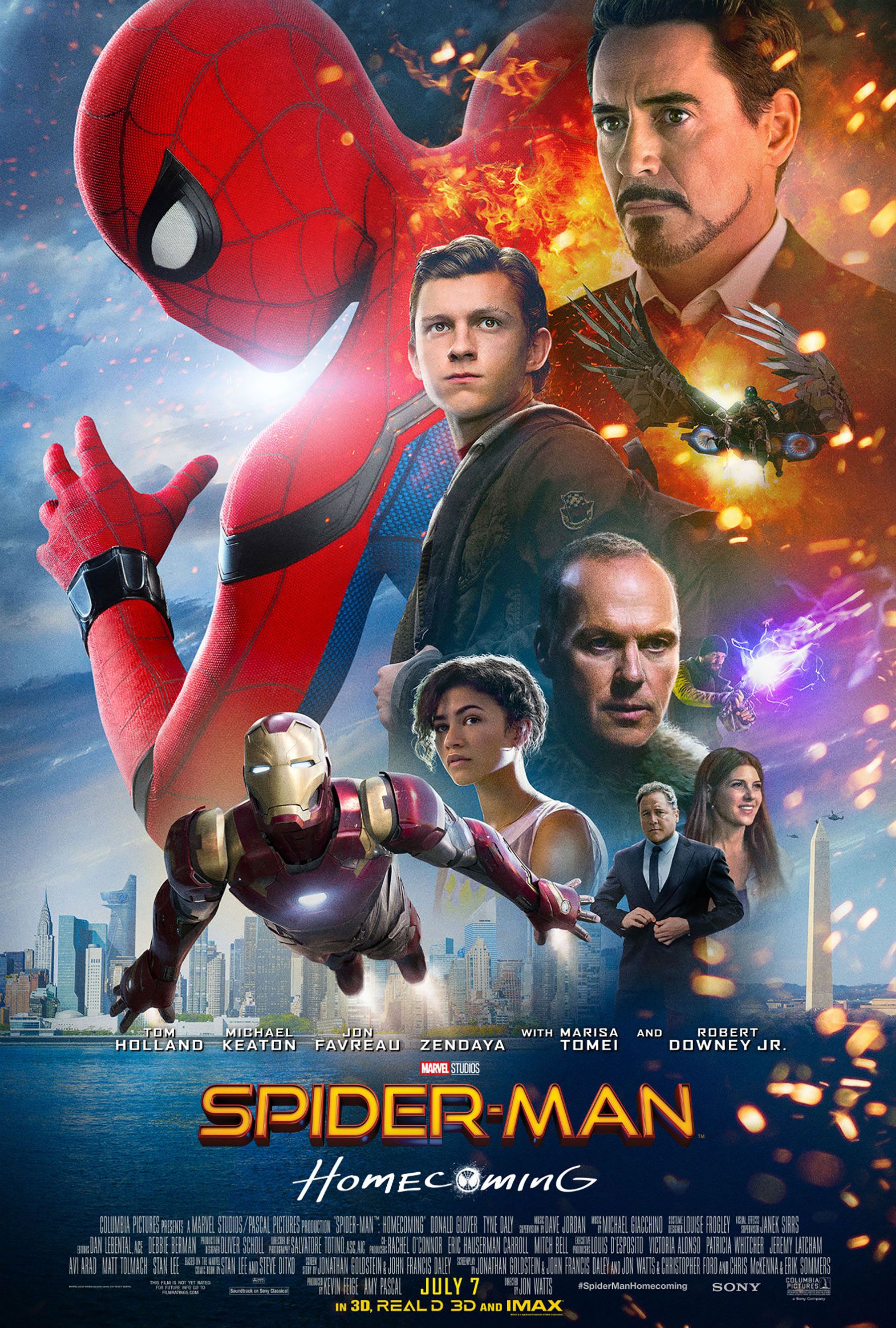
Years down the line after Tony Stark revealed himself as Iron Man, Spider-Man finally makes his way into the Marvel Cinematic Universe. After a well-received cameo in Captain America: Civil War, he went on to appear in his first feature film. While Spider-Man: Homecoming scored for critics and the box office, the same can’t be said for this poster here.
Let’s be honest, the poster looks like something you’d find on a pirated DVD at a stall by the road. Everyone’s faces are squeezed in against the New York skyline for the sake of it. The images blend together with a mix explosive effects, even though that’s not what the webslinger is about. Zendaya is in the film’s poster, strangely enough, despite not playing a big role in this film compared to Jacob Batalon’s Ned or Laura Harrier’s Liz. To top this off, notice how the Washington Monument just randomly pops in on the right side. If someone didn’t know any better, they would’ve thought the obelisk had taken place of Lady Liberty. Considering how Spider-Man posters tend to have pretty good vibes, Homecoming’s was a big disappointment.
24 Justice League
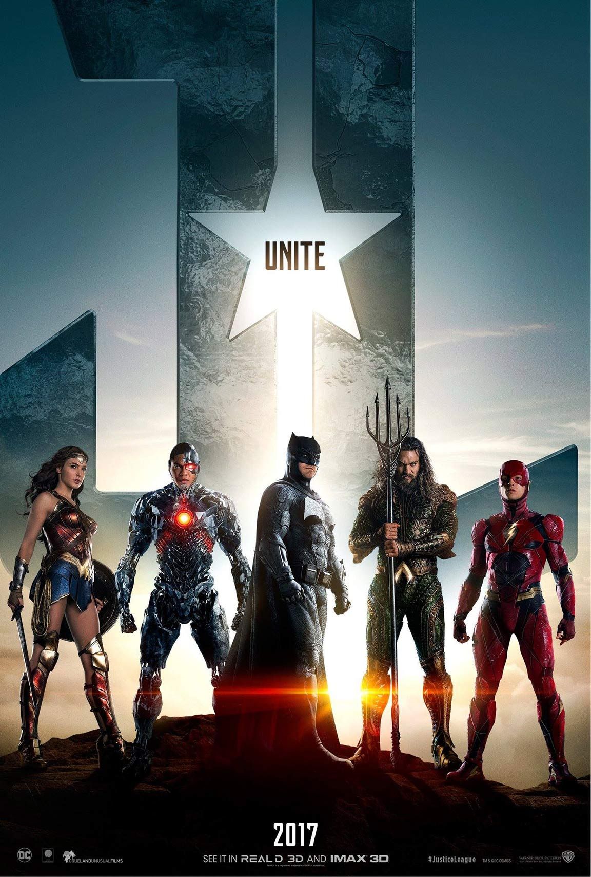
Even though Wonder Woman was an amazing film, we have to set a few things straight here. Gal Gadot is only 5’10”, which makes her very short compared to the rest of the Justice League cast. However, this isn’t quite reflected in the poster for the 2017 film. In fact, she stands at the same height as co-stars Jason Mamoa and Ben Affleck, both of whom are 6’4”.
Even with high heels, there’s no way she could make that height.
Maybe they wanted to frame the poster in such a way that the characters would stand together on equal ground. That certainly makes sense for a superhero team-up film. Still, you’d probably have to throw that idea out the window too. Try to look at the poster from a broader perspective. The heroes do stand at equal heights, but only for the most part. Ezra Miller’s The Flash is strangely short in this line-up, which can be really off-putting when you finally realise it. For the record, Ezra Miller stands at 5’11”, so he’s only a foot taller than Gal Gadot. If you weren’t privy to the actors’ heights before, this probably wouldn’t have bothered you. But I guess that’s not something you can forget now, is it?
23 Harry Potter and the Deathly Hallows: Part 1
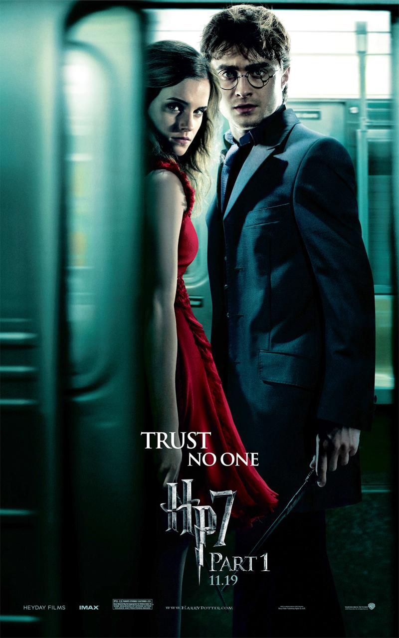
Between people walking through walls, piloting flying cars, and waving magic wands, there were plenty of intriguing experiences to behold in Harry Potter. Many have grown up alongside the cast to see the series through all its eight films. The films’ plot surrounding the Hogwarts School of Witchcraft and Wizardry certainly weren’t short of magical happenings. However, the magic appearing in this poster is most likely unintentional.
Harry, be careful sweetie. You don’t need another scar.
So what seems to be the issue? At a glance, you’ll see Harry and Hermione together in a train car where the door appears to be closing. Maybe they’re trying to blend in with the muggles, or maybe they have somewhere urgent to go. The poster does get the idea across that the two are no longer at Hogwarts for some ominous reason. Look closer at Harry’s head though. Was the message also that Harry’s would get his head caught in the door of a subway train? For this poster to have actually worked, the upper part of his head would have had to be photoshopped within the doorway. Thankfully, Harry never suffers such an incident in the movie, so this was most definitely an error on the designer’s end.
22 Frozen
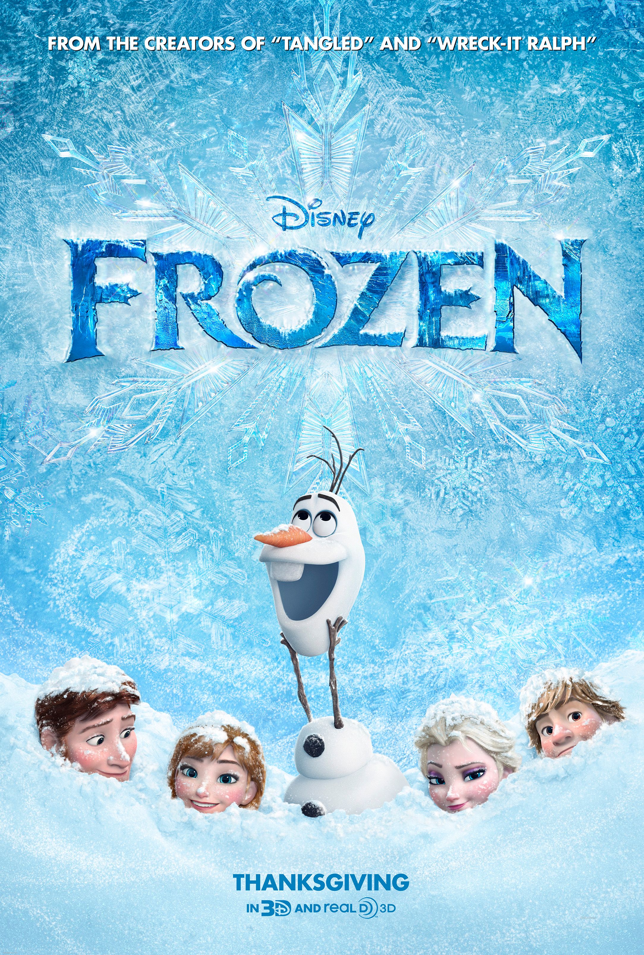
When you think of Frozen, you’re probably imagining Elsa together with Anna, as well as hordes of fans singing along to Let it Go. Indeed, Frozen has the esteemed title of highest-grossing animated film of all time and it’s all thanks to its loyal fan base. Even as time has passed, people are still creating fan art and sharing their love for the film’s world and characters. Some have even started naming their babies after Elsa.
Yet, here in this poster, many of the key characters are hidden and mostly buried in the snow. Their faces are shown, but a lot of their presence is diminished. The one character that does take centre stage is instead Olaf, the comic relief side character of the film. You might have thought he was the main character from this poster alone.
Of course, silliness is to be expected with an animated film, but it can be a little misleading to fashion a poster this way. It’s possible that Disney initially thought the silly snowman would be one of the key draws of the film, though we all know that ended up not being the case. A choice like this might send off warning signs that the company doesn’t have faith in its product, though.
21 Thor: The Dark World
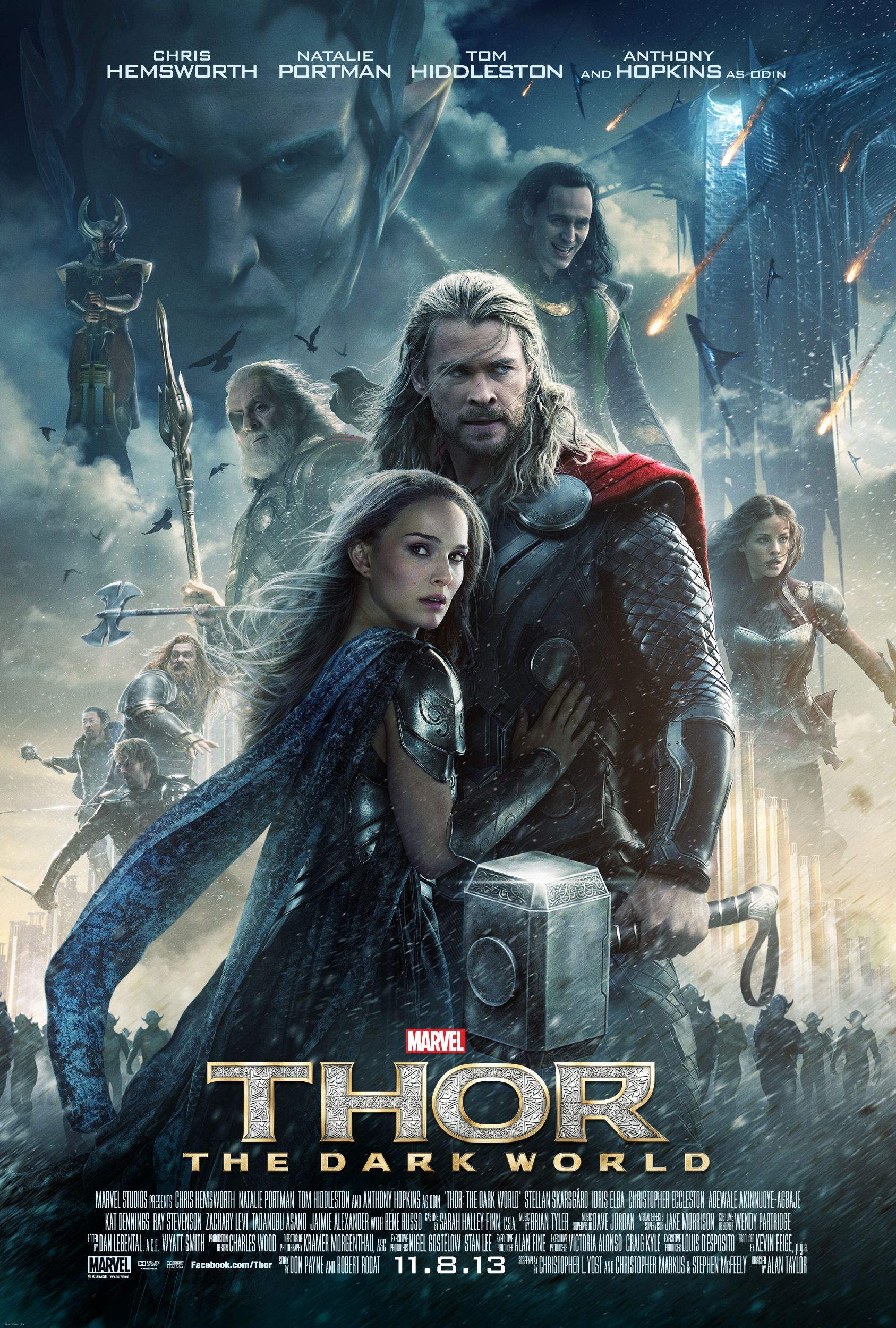
Is Heimdall standing on a cloud? No, seriously. And while we’re at it, let’s see if you can figure out who that small figure on the far left is. If those make you have to pause and think, then you probably see the problem with Thor: The Dark World’s poster. For whatever reason, someone decided to take ten people and somehow fit them all into a single small space. To give you a perspective, that’s just as many cast members as what the Age of Ultron poster shows. If that wasn’t enough, we have a horde of dark elves down below, a Dark Elf ship to the right, and fire hailing down all at the same time.
Visual and information overload is the easiest way to describe this poster. It’s hard to say why Marvel decided against a minimalistic approach. With the story revolving so much around Jane Foster, Malekith, and Thor and Loki’s brotherly bond, it would have made sense to cut back on the Asgardians and focus more on aspects closer to the main plot.
20 Avengers: Age of Ultron
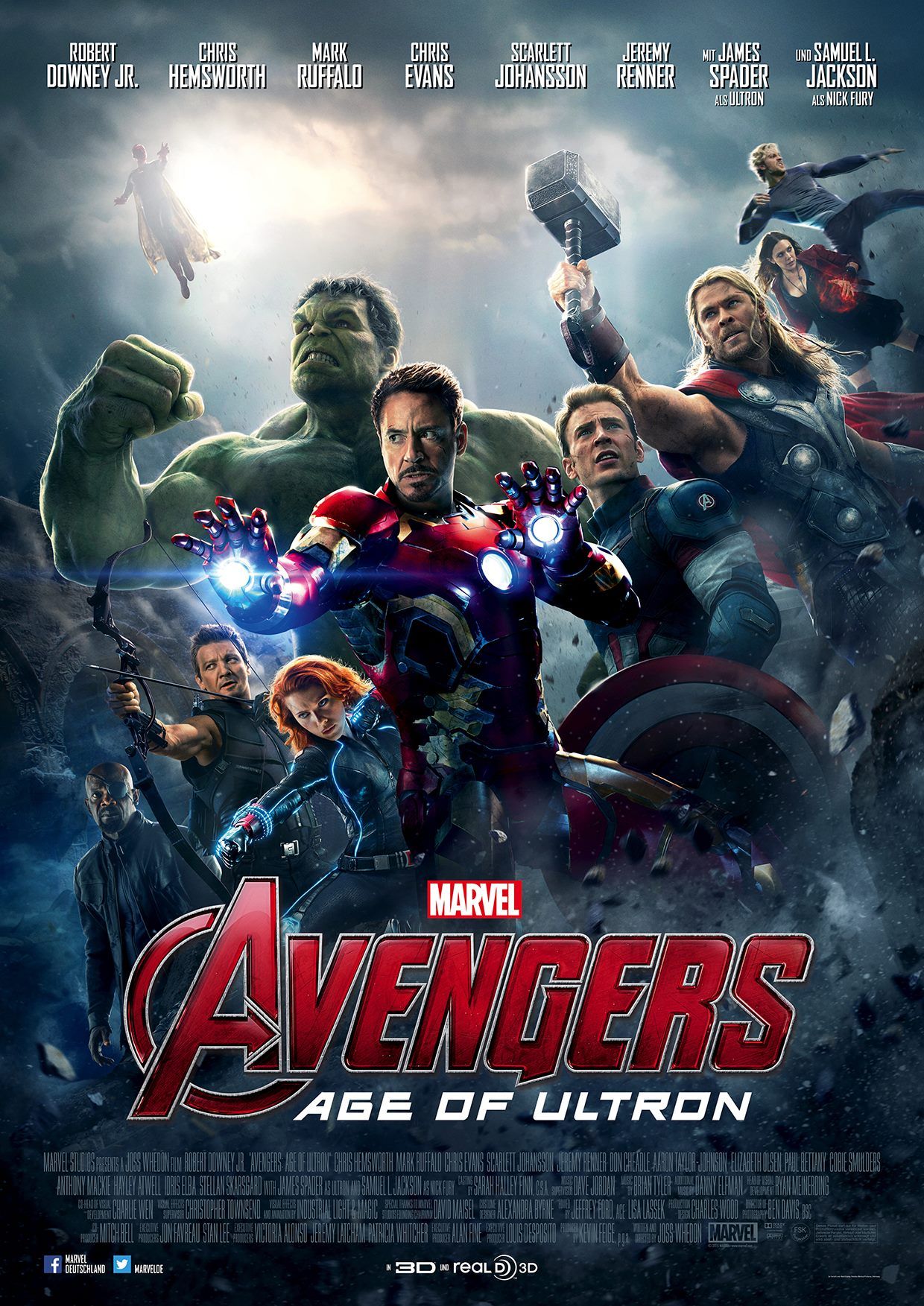
If Tomorrowland didn’t show enough of the main characters, then Avengers: Age of Ultron is pretentious with how it shows its own. It looks like Marvel was quite intent on shoehorning every character from the film into a single image. In this entry you’ll find the original Avengers gathered whilst surrounded by an army of Ultron robots.
The death robots are up there, Scarlett.
For some reason, Samuel L. Jackson’s Nick Fury is also there for the fight (he wasn’t), while Scarlet Witch and Quicksilver float around on the side at a peculiar angle. After the success of the first Avengers movie, Marvel Studios was clearly looking to up the ante. While the scale of the film was certainly vaster in Age of Ultron with more at stake, the group might have also been trying a little too hard to beat out the first film’s poster of a ravaged New York. At the end of the day, does it really matter, though? Despite the mediocrity in the poster, a lot of people probably decided to watch the film anyway.
19 Percy Jackson & the Olympians: The Lightning Thief
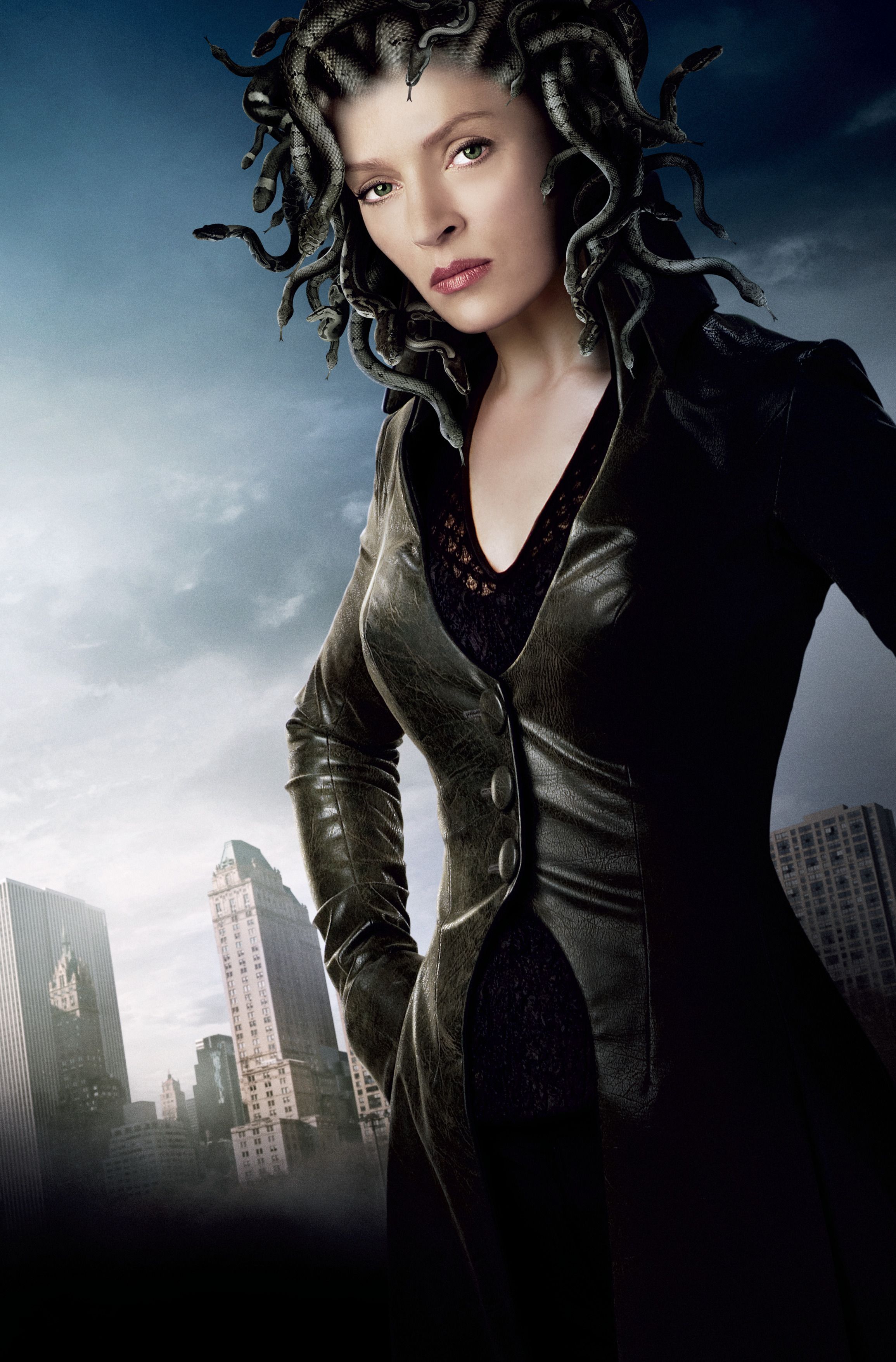
Tweens and teens alike had a strong fondness for Percy Jackson. While not as popular as J.K. Rowling’s Harry Potter, Rick Riordan’s series of tales surrounding the titular son of Poseidon wasn’t without a loyal fan base. The first book was written by Riordan in 2005, from which he wrapped up the Percy Jackson & the Olympians saga in 2009. In 2010, however, the first book was adapted and shown in cinemas to commercial success.
The film starred Logan Lerman as Percy Jackson, but also had Uma Thurman in small antagonistic role as Medusa. Take a look at the promotional material the movie had for her. It’s true that Medusa was a female creature who had living venomous snakes in place of her hair. Still, the way this is portrayed in the poster seems half-baked at best. Never mind that the Medusa from the myth was supposed to look a lot uglier. The real issue is that the snakes on Uma Thurman’s head don’t look like they’re actually attached. There’s a poor attempt at trying to fuse the snakes to her scalp and even if they had succeeded, the snakes don’t cast a shadow of their own. It isn’t particularly great promotional material, but kids were probably more excited to just see an adaptation of their favourite book.
18 Spider-Man 3
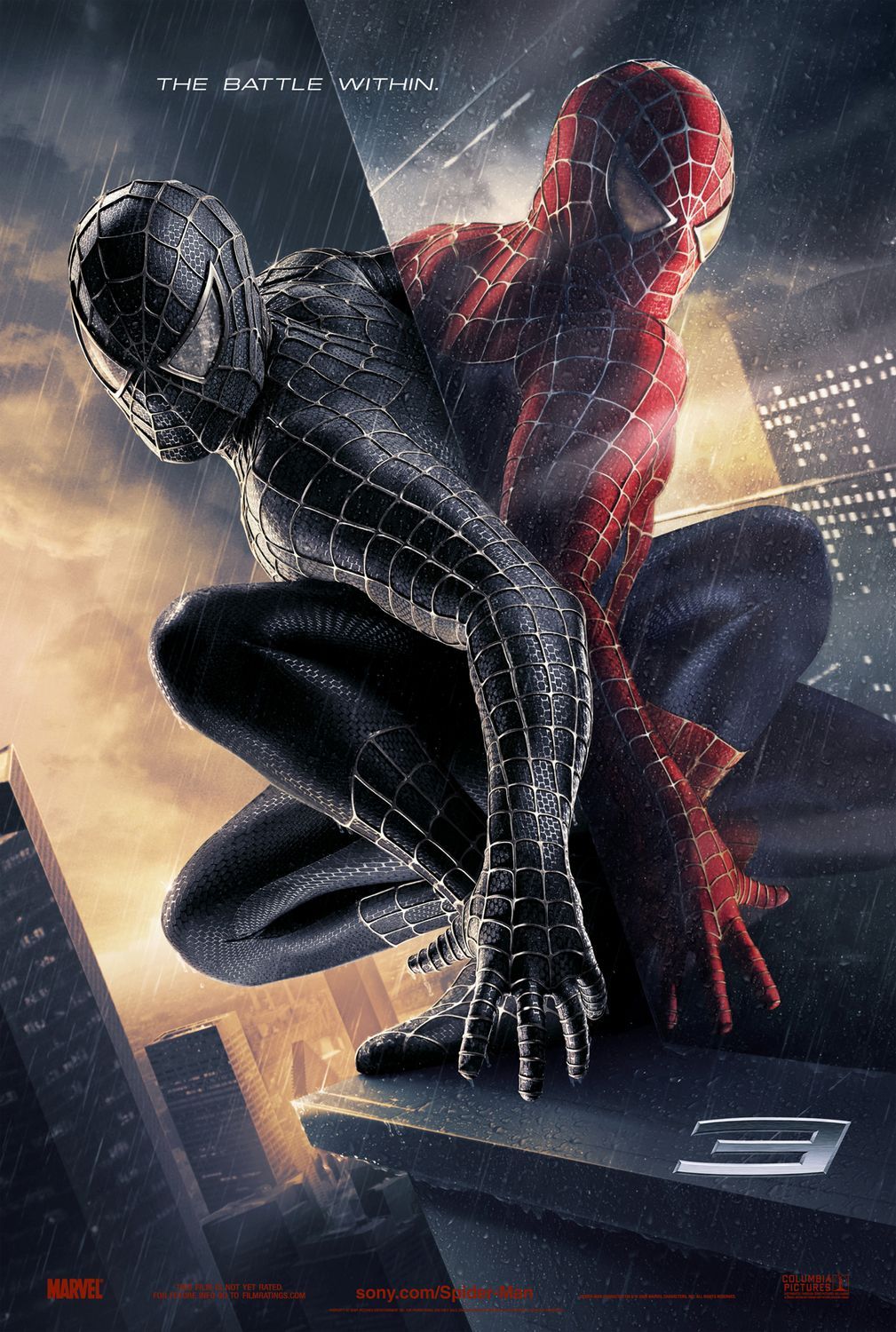
The old Spider-Man trilogy directed by Sam Raimi is a classic that still resonates in the hearts of many. While the first and second film were well-received by critics and fans alike, many considered the third to be a lukewarm entry. In any case, a big part of the film’s plot involves Tobey Maguire’s Peter Parker wearing the alien symbiote suit. The suit amplified his negative emotions immensely, which threw his dual-life as Peter Parker and Spider-Man into disarray.
In the spirit of that concept, many of Spider-Man 3’s posters strove hard to demonstrate this duality. One of them in particular shows Spider-Man in his black suit perched on the side of a building. Reflected on the windows is his normal self in the iconic red and blue. But let’s stop there for a moment.
Is that really Spider-Man’s reflection?
You would initially think so, but that quickly doesn’t become the case if you look a little closer. Notice how Spider-Man’s left palm isn’t reflected in the image, despite being at the right angle. Furthermore, a small bit of his torso is clearly visible in the reflection when it’s supposed to be blocked by his thigh. It’s not quite a big mistake, but it might make you second-guess keeping that poster hung up in your bedroom.
17 The Adventures of Sharkboy and Lavagirl in 3-D
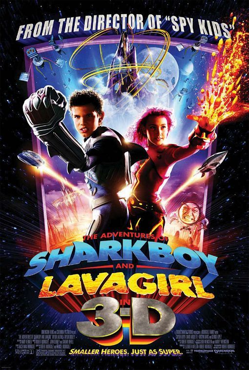
Back in 2005, Taylor Lautner broke into the movie scene with his first lead role as Sharkboy in The Adventures of Sharkboy and Lavagirl in 3-D. Phew, that title’s a mouthful. But yes, that attractive werewolf you know and love from the Twilight saga first had his humble beginnings here. The movie was marketed as a big film for kids which utilized 3D anaglyph technology. Think of those those red-and-blue 3D glasses you used to wear back when they were a thing.
If you look at the poster, you’ll see the usual fare of movie poster poses. Sharkboy and Lavagirl are both looking forward and you get the idea that these are children with special abilities. You’d also be forgiven if you thought that Sharkboy was supposed to have oversized hands as part of his power, considering lava spews out from Lavagirl’s. In the movie, Sharkboy’s hands are always regular-sized and he’s more of a martial artists than anything . It seems that his left hand was blown out of proportion here in an ill-attempt to further market the movie’s 3D gimmick. It also seems doubtful that many children got this idea either when they first saw the movie poster.
16 Yogi Bear 3D
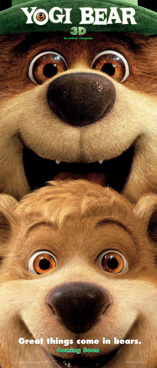
You know, we’ve never met a taxidermist or seen their works in person. After seeing this poster, though, we’re frightened to ever take that chance. Based on the old animated TV show from 1861, The Yogi Bear Show, this film was meant to revitalize the cartoon for a modern audience using 3D animation. That’s all fine and dandy, but the execution leaves a lot to be desired. The poster shows Yogi Bear and his side-kick Boo-Boo bear both looking forward with gleeful smiles. It’s hard to say what the people here were looking for, because it’s just plain… creepy and a little unsettling.
These two totally belong in Five Nights at Freddy.
Yogi Bear looks like he’s about to outright eat his sidekick, while Boo-Boo himself might be okay with that prospect. Or maybe they’re trying to eat you, instead. In any case, it’s hard to imagine that any kid would take this for the family comedy that it is from the poster alone. Whoever gave the go-ahead to make this poster made a big mistake. Not only is the Yogi Bear cartoon too ancient for them to know any better, most children are taught to think of bears as dangerous beasts.
15 Peter Rabbit
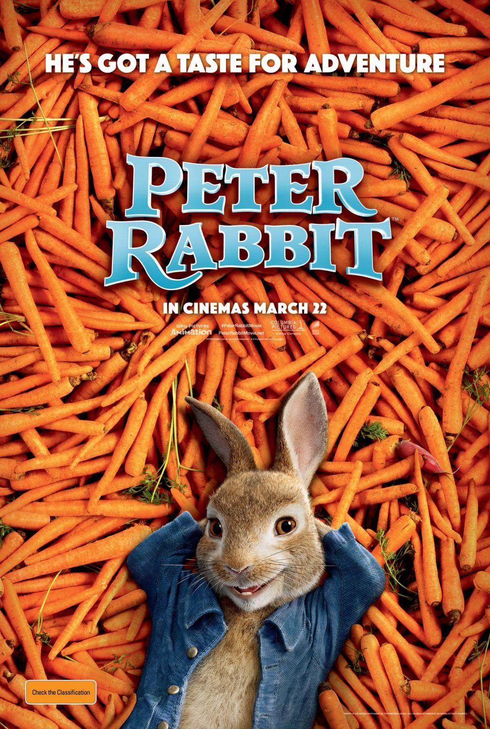
Oh boy, where do we start with this one? So you may have guessed already, but Peter Rabbit first started out as a series of children’s books all the way back in 1902. Interestingly, this also was a time when Peter meant more than just a boy’s name. What else did it mean, you wonder? Well, let’s talk about the poster first.
This poster just reeks of symbolism for all the wrong reasons. It shows the titular character lying on a pile of carrots. With hands behind his head, an open shirt, and an eager smile, he looks just as inviting as someone on the cover of Hugh Hefner’s famed magazine. To make things even worse, the lower half of his body is pretty much cropped out so…
Anyway, if you haven’t gotten the gist of things, the Peter Rabbit poster is a combination of all sorts of symbols not suitable for children. Peter, a euphemism for the little wiener, seems to pair far too well with the character’s cropped pose on top of long and hard orange vegetables. Even if kids don’t catch on to the implied meaning, adults might just hesitate to bring their children along. Yeah, I don’t think they thought this poster through.
14 Mighty Morphin Power Rangers: The Movie
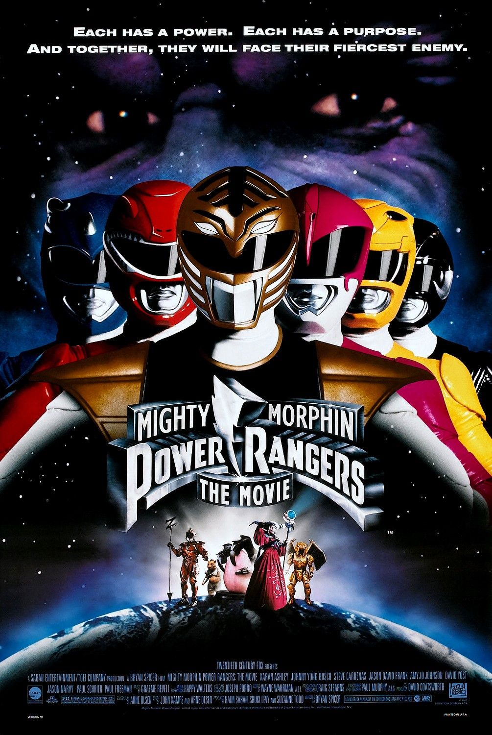
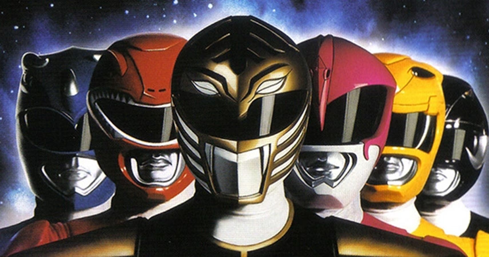
Saban’s Mighty Morphin Power Rangers was an instant hit with the kids of the 90s era. Inspired by Super Sentai franchise, the TV show would feature teenagers in colour-coded full-body suits and giant mechs to fend off evil monsters. The series was developed by Toei Company, Shotaro Ishinomori and Marvel Comic. Riding on this success, Saban Entertainment thought it would be good to up their game with the Power Rangers’ first ever feature-length film.
Mighty Morphin Power Rangers: The Movie was a bigger and better version of what kids loved.
So what’s wrong with the poster, then? Luckily, not much. But, take a look at the poster closely and you’ll see the obvious issue. The film features only six power rangers, but they’re aligned disproportionately in the poster. The White Ranger stands in the middle while three Rangers stand to his left and two on the right. If you’re a fan of show, this arrangement probably makes sense. The White Ranger, also known as Tommy Oliver, has been one of the most popular characters in the franchise, after all. Still, this line-up also throws symmetry out the window and causes some niche favourites to get hidden a little too much (poor Black Ranger).
13 The Shaggy Dog
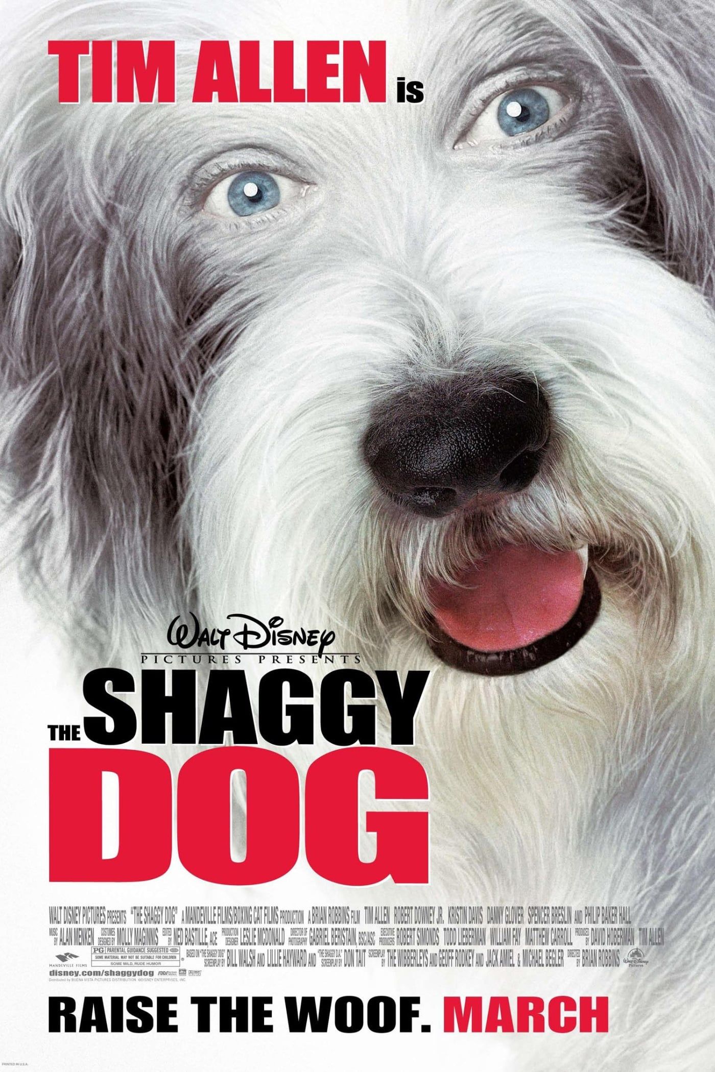
The Shaggy Dog was a 2006 family comedy starring Tim Allen as district attorney Dave Douglas. The remake of the original 1959 film shows Dave getting infected by a 300-year old sacred dog, which makes him uncontrollably transform into the same likeness of a Bearded Collie. It sounds like an interesting movie to spend time with the kids on, except the movie’s poster gets this idea across in a not so comforting way.
Take a look at the dog’s eyes in the poster. Yeah, whoever edited this picture decided to take Tim Allen’s eyes, simply paste them over a Bearded Collie, and then call it a day. We’re not sure it even gets across whether Tim Allen is voicing the dog or is transforming into one.
Sure, a Bearded Collie is cute and what kid wouldn’t love to see such a fantastical premise? It’s just that the poster is remarkably eerie and makes one wonder whether they’re going to have to watch an entire film of a dog with human eyes. Thankfully, that does not happen to be the case in the film itself. Still, the poster certainly doesn’t do the film any favours in that regard either.
12 The Spy Next Door
Jackie Chan is probably the biggest Chinese movie star out there. With well over 200 films under his belt, there’s much that can be said about how hardworking of a man he is. The man has suffered more broken bones in his career than most people would in their lifetimes.
Even a legendary actor can be in bad movie posters.
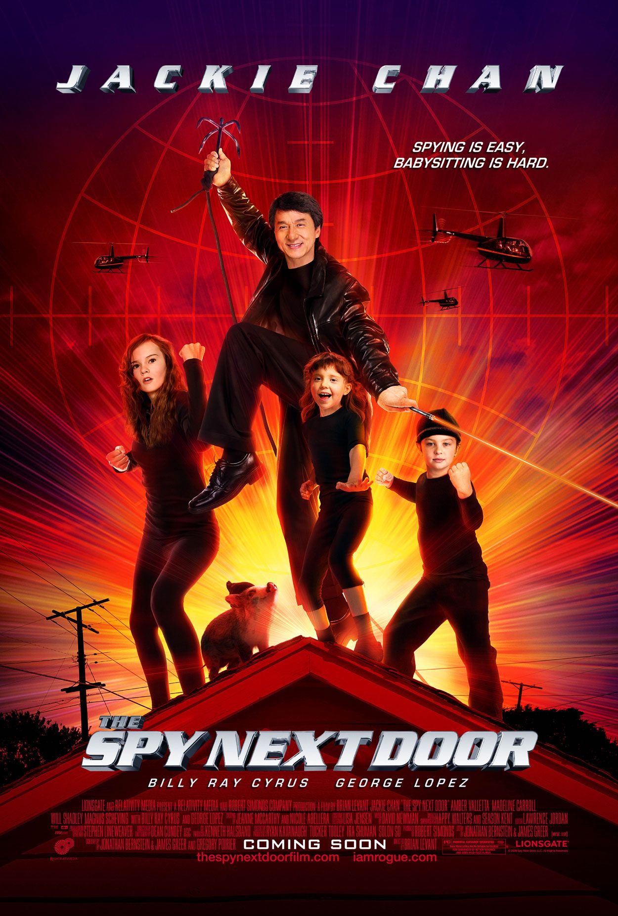
Enter 2010’s The Spy Next Door. Jackie Chan isn’t new to comedy films. In fact, his breakout performances in the US were through action comedies such as Rush Hour and Shanghai Noon, in which he starred alongside Chris Tucker and Owen Wilson respectively. In this film, he plays Bob Ho, an undercover CIA agent who takes up the unfortunate task of babysitting children (because we all know that’s harder than spying).
In this poster, we see Jackie Chan and the three children he babysits. Cheesiness of the poster aside, what’s most glaring is how badly photoshopped it is, to the point that Jackie’s right leg looks like it belongs with a flamingo. Just imagine if he were to stand up straight with those legs. Not to mention that the Hong Kong superstar is only 5’ 8” tall. Feeling disturbed yet?
11 Looney Tunes: Back in Action
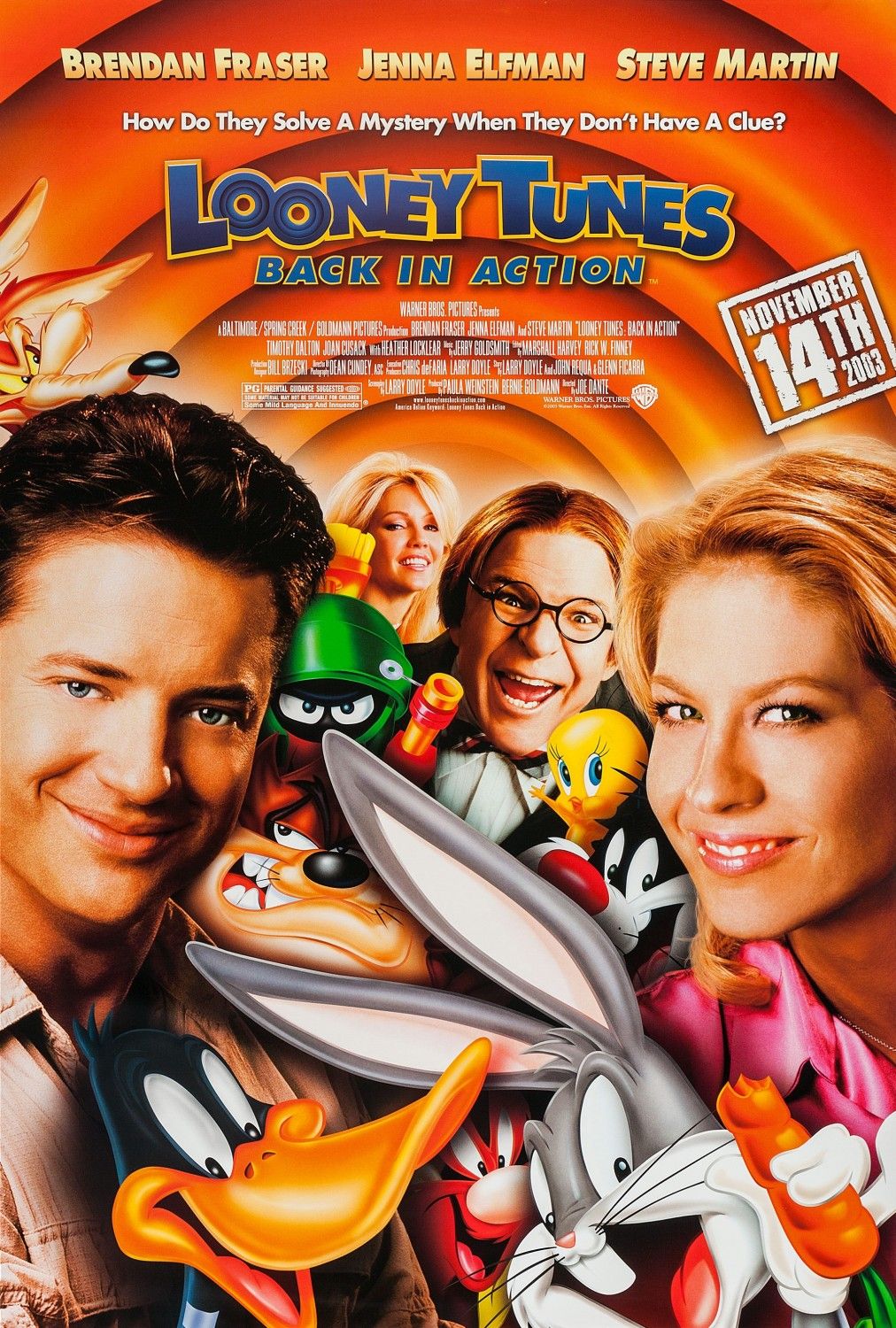
Remember that time when film producers would often mix 2D animation with live-action? That’s looking to be a bygone era with the advent of 3D, but who’s to say that the format doesn’t still have its charm? In Looney Tunes: Back in Action, Brendan Fraser and Jenna Elfman interact with all sorts of Warner Bros. cartoon characters. From Bugs Bunny and Daffy Duck to Scooby-Doo, the movie was a wild ride of crossover characters long before Marvel started making its mark.
It’s such a shame, that the movie poster doesn’t look that great. If you pay attention to the outer lines of Bugs Bunny, for example, you’ll find that a very mediocre shadow has been applied. None of the shadows actually look like they blend in with the live-action actors. There’s also this yellowish glow along the outer edges of the cast that totally removes them from the iconic circular background. The poster just doesn’t convince that these characters live in the same world. To be fair, pulling off a movie poster where real people stand in the same space as hand-drawn characters can be difficult. However, everything does look much crisper and clean in the movie itself, which makes you wonder.
10 Home Alone 2
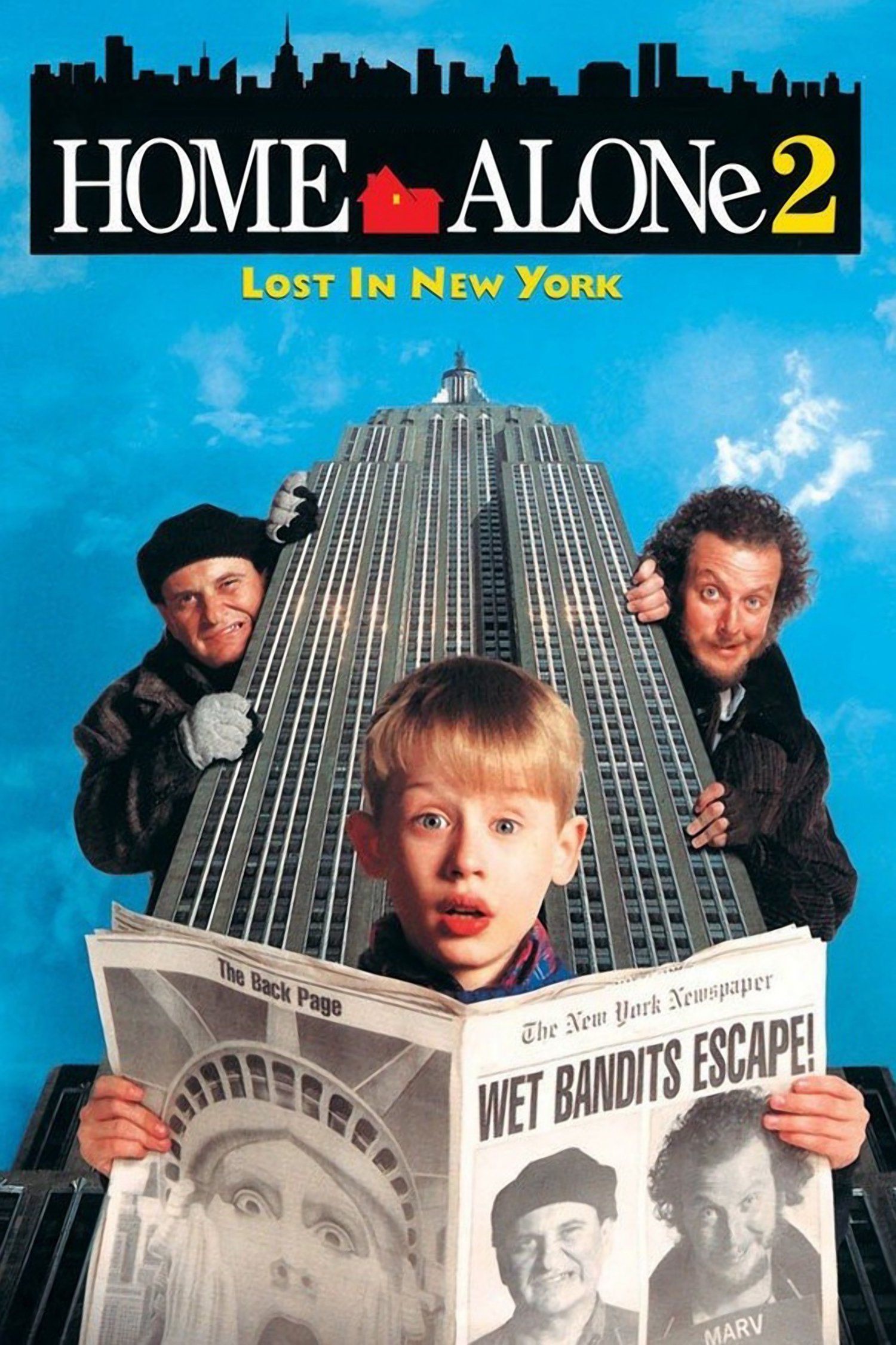
In 1990, nobody expected that a family film about a boy defending his home from a couple of bungling burglars would become an instant classic. With just one movie, Macaulay Culkin shot to instant fame as the kid star who portrayed Kevin McCallister. Not only was Home Alone considered a must-watch for family occasions, it also doubled as the perfect movie for a Christmas marathon. Home Alone 2 came out in 1992 with the original cast reprising their roles, but it wasn’t exactly about Kevin protecting his home again. Instead, the boy would take a wrong vacation flight to New York and end up running into the same burglars from the first film.
“Here we are Marv. New York City, the land of opportunity.”
Home Alone 2’s poster tries to set off the vibe that Kevin is not in the little leagues anymore. A skyscraper towers above him, while gigantic versions of the two Wet Bandits, Harry and Marv, look on mischievously. But why do these burglars look like they’re holding up a cardboard cut-out of a building instead? The problem here is that the perspective of the building against the burglars’ own stances don’t match up. Indeed, they look like they’re standing perpendicular to the building rather than leaning over to the side.
9 Antz
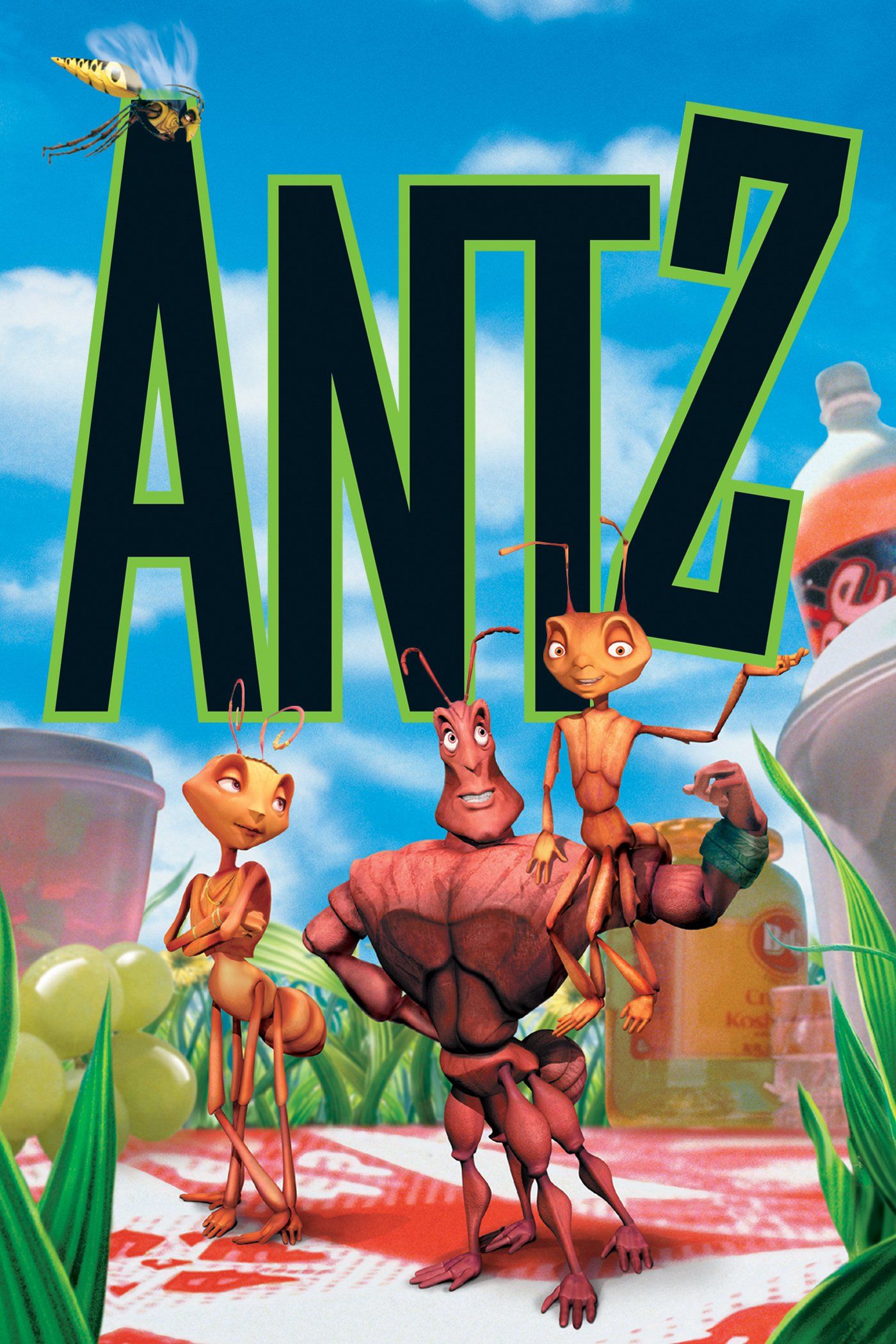
Pixar was just done with the success that was Toy Story and promptly started on its second feature film, A Bug’s Life. To the company’s dismay, however, Dreamworks was also working on its own 3D animation film, Antz. Not only did Antz also revolve around insects, it released just a little under two months earlier than Pixar’s own movie. Maybe you vaguely recall seeing the two movies being promoted together and being a little confused. Antz was nothing to scoff at, achieving critical praise and starring big celebrities the likes of Woody Allen, Sylvester Stallone, and Jennifer Lopez.
Z, Princess Bala, and Corporal Weaver are all present in the poster as the main characters of the film. Their poses have charm, and the background does give off the vibe that we’re dealing with tiny creatures. But look to the top left and you’ll notice a random wasp just flying by. That would be Chip the Wasp. Seeing as Z holds the letters up and Chip flies in front of them, that perspective would make you think he’s supposed to be as large as Z’s head. Except, he’s many times larger than the ants in the film. It’s a minor oversight, but quite jarring when the only side character to appear in the poster gets mistreated that way.
8 Superbabies: Baby Geniuses 2
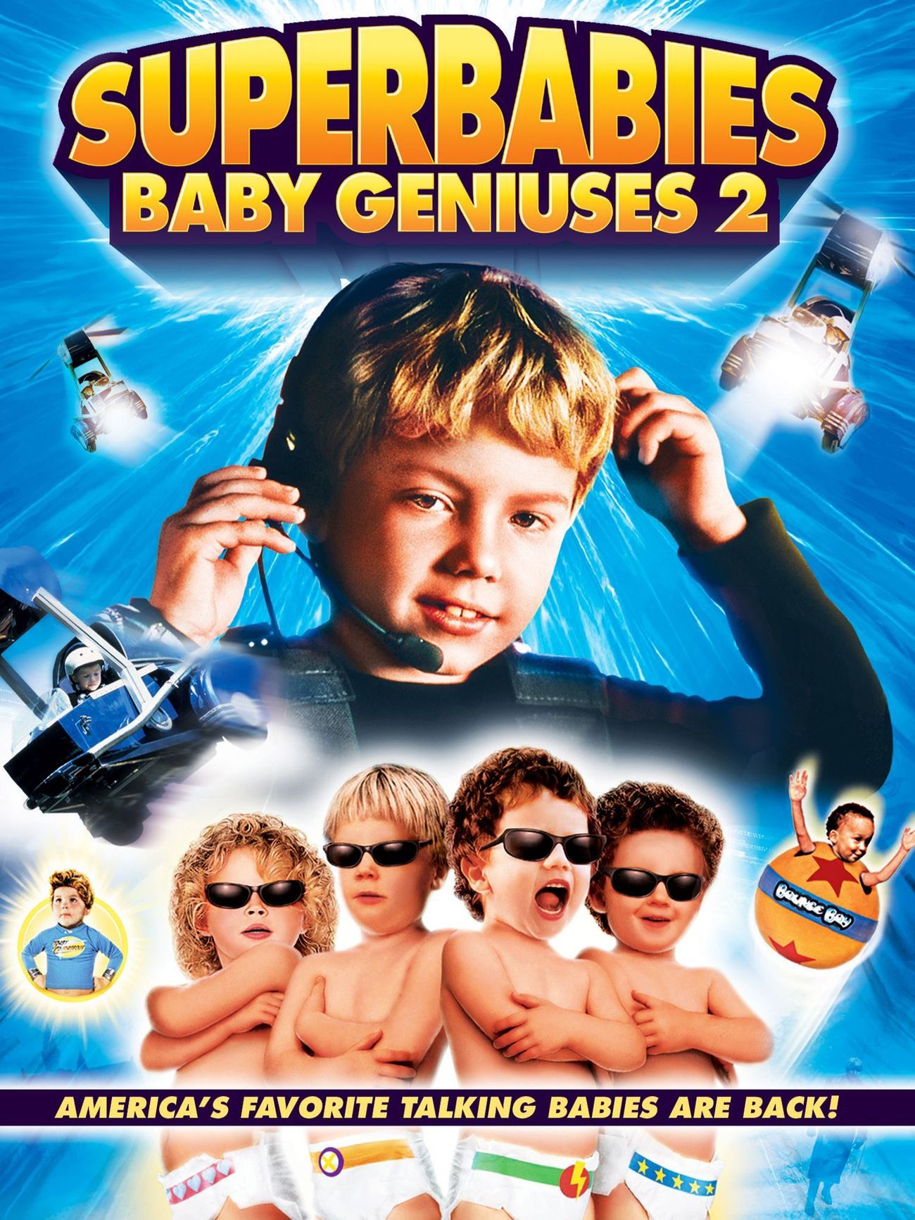
You’re forgiven if you’ve never heard of this film. Superbabies: Baby Geniuses 2, like its predecessor, is regarded is one of the worst films of all time and was universally panned upon release. The 2004 release stars, as you would have guessed, a group of baby geniuses. These infants work together to stop a media mogul from brainwashing the population into being lazy and so that they’d watch TV all day. In any case, the film was a box office bomb, earning only half the revenue from its $20 million budget.
Academy Award winner Jon Voight actually played the villain in this movie.
Let’s have a look at the poster. Nothing says cool like four infants with obviously photoshopped shades over their eyes, right? Not only that, their heads don’t look like they belong on their bodies. All of these combined make for a view that’s more disturbing than cute, especially when these babies are standing cross-armed that way. Let’s not forget the flying mini choppers and… whatever those things next to the babies are. The poster simply makes no sense, but hey, maybe someone enjoyed this film as a kid. Nobody’s judging.
7 Tomorrowland
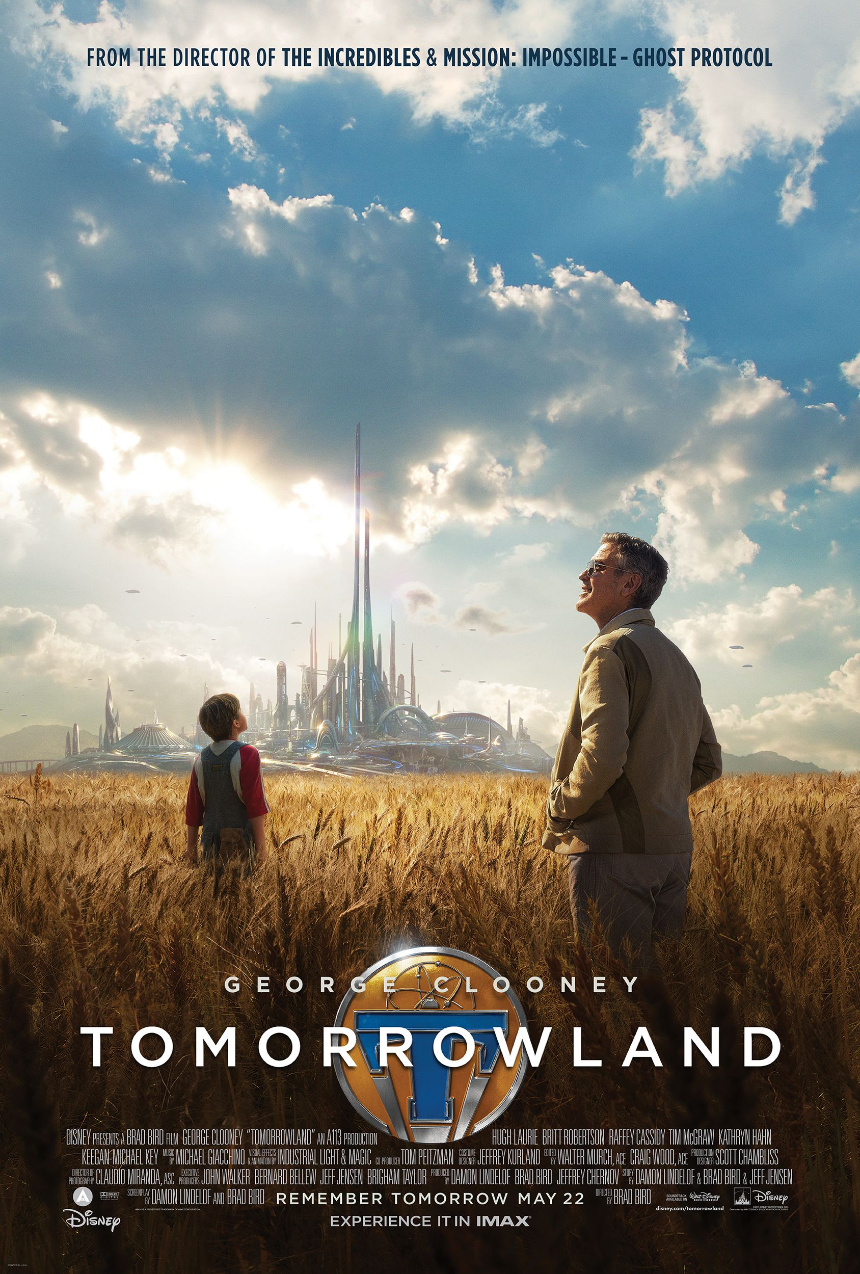
Tomorrowland’s poster is a beautiful view of an open landscape, depicting George Clooney and a little boy standing in a wheat field as a futuristic city looms in the horizon. Visually, there isn’t much fault to find in the poster. It creates intrigue and promises a heartfelt journey. Plus, who doesn’t get interested in a film featuring an all-time great such as George Clooney? Except the poster entirely neglects to mention Tomorrowland’s other main character. If you haven’t watched the film or seen the trailers, you would not have realised that Casey Newton, played by Britt Robertson, is George Clooney’s co-star in this film.
Casey Newton actually plays a main role in the story, even taking point of the narrative on various occasions. The boy in the poster is, in actual fact, simply a younger version of George Clooney’s Frank Walker. In a modern world when female representation is more important than ever, it’s a miracle that the film’s marketing didn’t get any of the flak that we’ve come to expect. To Disney’s credit, it did market Britt in various other posters, just not on the primary ones.
6 Night at the Museum: Battle of the Smithsonian
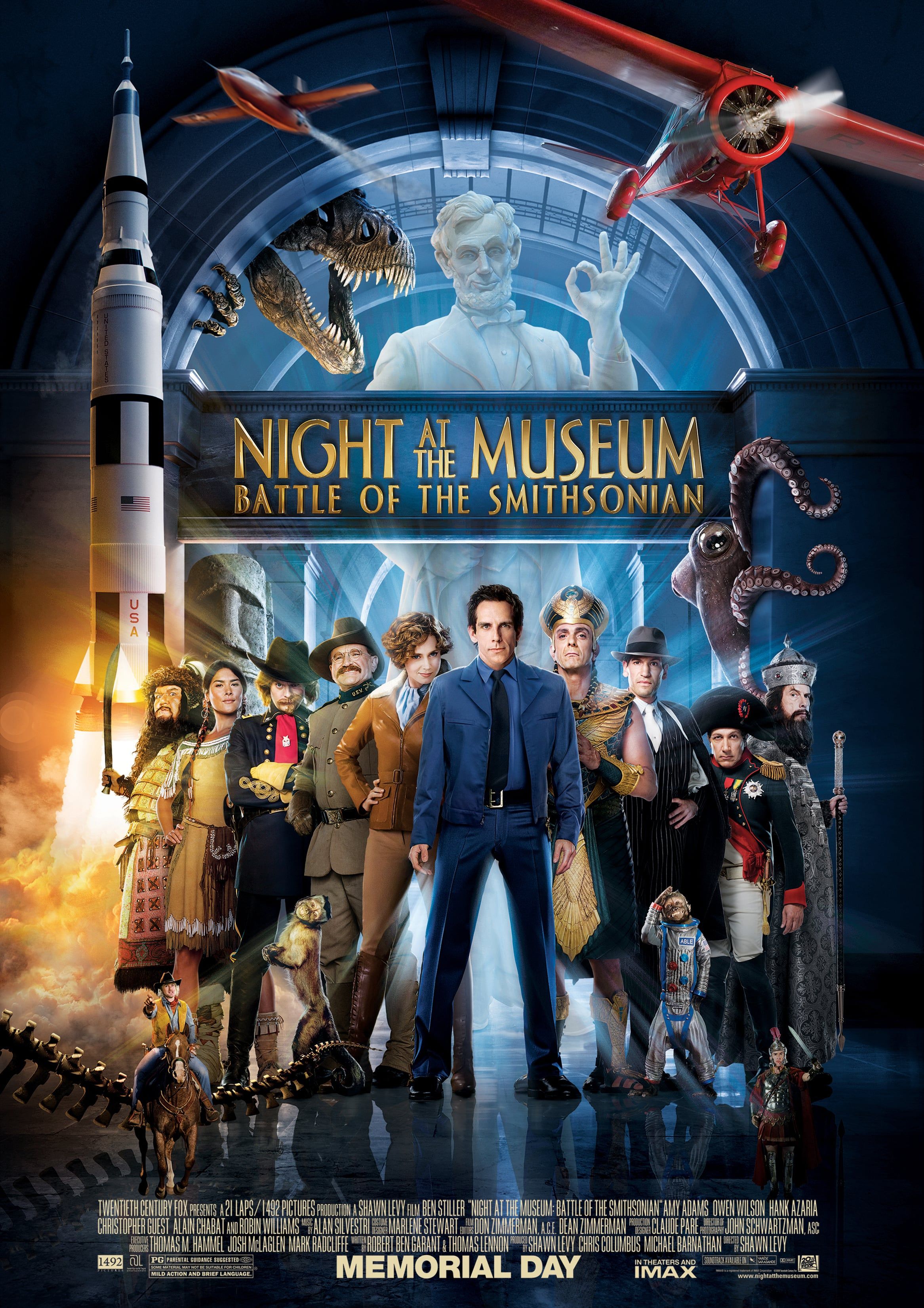
One of the special aspects of Night at the Museum was its ensemble of some of the best comedians in the business. Actors such as Ben Stiller, Owen Wilson, Steve Coogan, and the late Robin Williams all appeared in an intriguing story of museum displays come to life. It’s also fun romp of a film for the family.
Monkeys, a giant octopus, and… a launching rocket?
But no, it’s not the rocket that’s the problem here (unless you want it to be). Pay close attention to little Owen Wilson on the left. The miniature cowboy is riding his horse and posing just fine with the rest, except his reflection on the floor is somehow absent. The same goes for Roman soldier Steve Coogan plays on the right. Apart from that, Ben Stiller seems remarkably tall for a 5’6” man, even trumping the much taller Hank Azaria on his left. Lastly, speaking of Hank Azaria, it looks like he has his foot stamped firmly on the foot of the little space monkey on his left. Now that’s just mean.
Link Source : https://www.thegamer.com/unforgettable-kids-movie-poster-mistakes/
