
Remembering The Ugliest Pokemon Gen 1 Sprites
Mew was not the only ugly Pokemon to get a glow up later on
You Are Reading :Remembering The Ugliest Pokemon Gen 1 Sprites
Category : Pokemon

One of the reasons Pokemon has endured for 25 years is how cute the little monsters look. Whether you want the next Pokemon game to have all new ‘mons or stick to the classics, the cuddly creatures are at the heart of why we all love Pokemon. Some of us even love them a little too much. Looking back at where it all started then, it’s a surprise they’re all so damn ugly.
We all know about Mew, with its malnourished body, curved spine, and spindly little tail flailing around, but Mew is often treated as the exception. As the one ugly little freak amongst the otherwise perfect line-up of cute and charismatic characters. But Mew isn’t the exception, it’s the rule.
Most of the Pokemon back in Gen 1 were, in fact, as ugly as Mew. Back then, Pikachu was fat, but we also had Golbat with its horrific dripping tongue. Zubat, along with Tentacool, was the most annoying Pokemon in Gen 1, but looking back on the monstrous version of Golbat it evolved into, I’m surprised it’s evolution wasn’t higher up on the list of reasons I hated it. Speaking of Pokemon I hate, Koffing is upside down for some reason, and Weezing looks even more grotesque than usual. In some ways, this might be the truest version of Weezing, who was always supposed to represent the noxious deformity, but on the other hand, it’s butt-ugly.

The most notable ‘mons aren’t just ugly though, they’re straight up bad. Kingler, Kabutops, and Poliwrath, three Pokemon you’d never hear mentioned when discussing the Gen 1 sprites, all look like they’ve been drawn by five year olds. I know the sprites were restricted by the pixel limitations, as we see in the likes of Venusaur, Charizard, and Blastoise. The three starters all look like shadows of their most perfect form, but we can at least see what they’re trying to do. Kingler, Kabutops, and Poliwrath, I have no clue.
For some reason, Kingler has been shot from an unflattering low angle, holding both claws out to frame itself terribly. Kabutops has the same angle, but is vaguely squatting for some reason, which is just charming. Meanwhile, Poliwrath is doing a karate chop that gives it a humpback for some reason? I mean, sure, I guess.

The Machop line is even worse, all in various gangly dance moves, while Geodude’s crunchy top makes it look like he has a spiffy Elvis do. Mankey looks quite good except the artist forgot how to draw arms, and Tangela just seems like loose ribbons rather than a coherent tangle as it’s meant to.
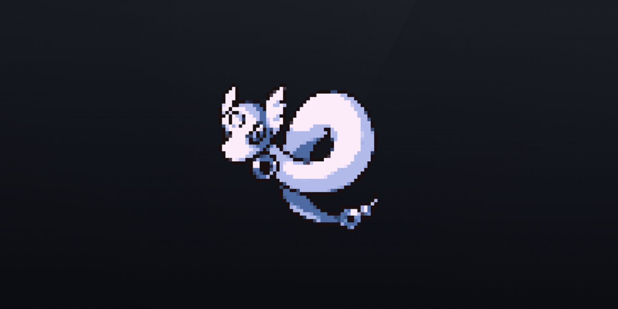
There are some bright spots. Dragonair, so graceful in later versions, is coiled and ready to attack. Gastly feels more ghostly and otherworldly here, while I have to love Tentacruel’s unimpressed folded arms. Or tentacles, at least. Meowth, Sandshrew, and Vulpix have never looked cuter, Nidorina is more porcine than ever seen since, and neither Nidoking nor Nidoqueen seem held back by the design limitations that affect the others. Eevee is a little borked, but the eeveelutions all work it, and Hitmonlee and Hitmonchan are suitably dynamic. Unfortunately, they sit next to Marowak, who looks very stupid.
Pokemon Yellow gave a lot of these Pokemon a glow up, which continued in Gold & Silver, but it’s the anime which helped establish the canon look of these creatures for the next 25 years. It’s a good job too, because I could not have endured two and a half decades of that ugly Poliwrath.
See more : PokemonWe