
Does The Nintendo Switch Have The Saddest Home Screen Of All Time?
There are no themes, no music, and no point to the Nintendo Switch home screen
You Are Reading :Does The Nintendo Switch Have The Saddest Home Screen Of All Time

The current generation of consoles all have pretty mediocre home screen menus. The PS5 interface is game-centric (though becomes more fiddly if you want to do something other than play a game) but insultingly peppers you with adverts for games you already own. Where on the PS4 you could set themes or use images, now the background is dictated by the game you roll over. Hover over Far Cry 6, get an advert for Far Cry 6. The Xbox Series X does let you set a custom picture, but the screen is so busy that you can’t really see it. It’s also less focused on games, instead highlighting whatever you used last, even if it was settings. By far though, the saddest menu belongs to the Nintendo Switch.
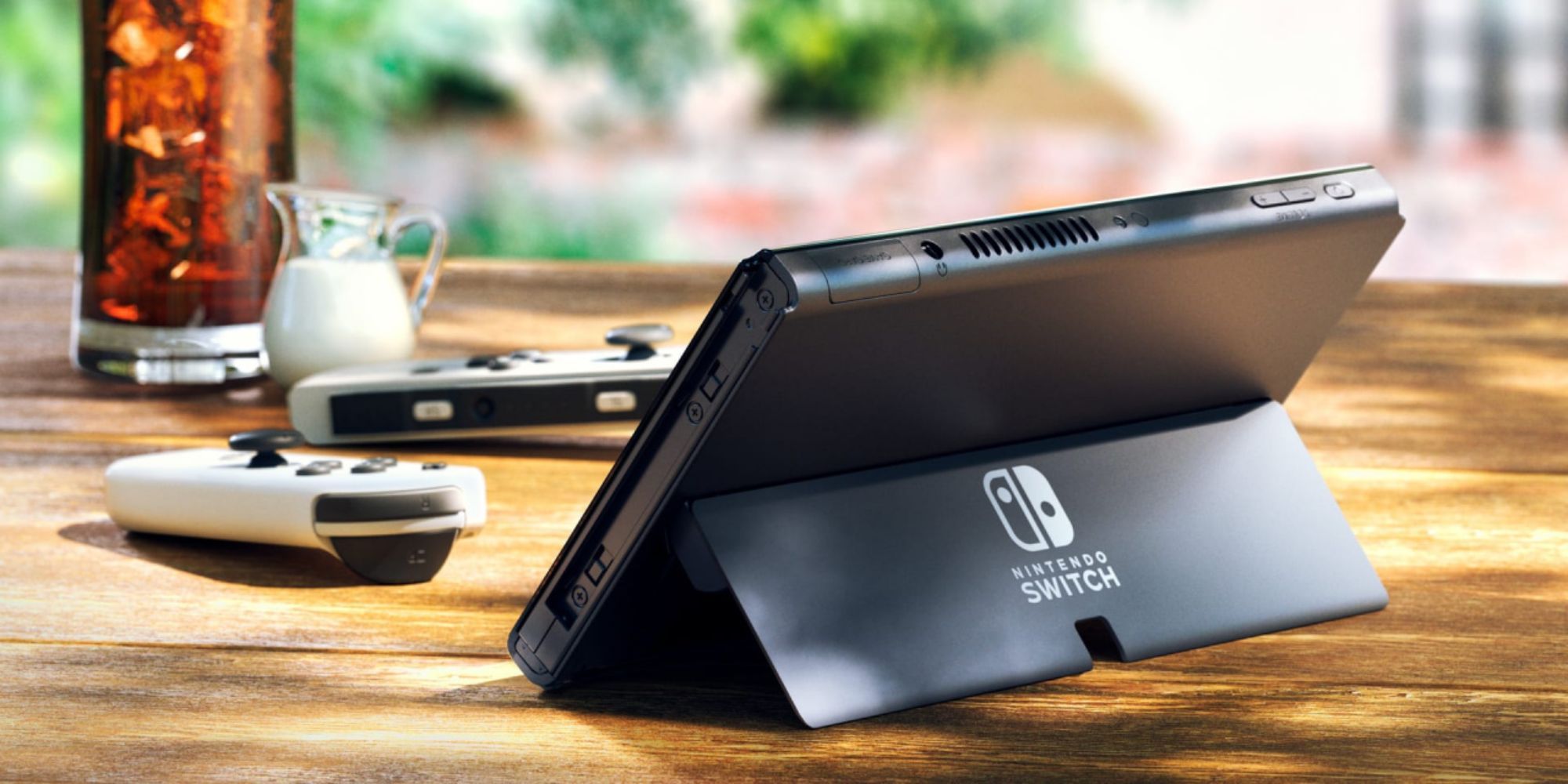
The Nintendo Switch menu is a selection of game panels, with some smaller buttons for settings, eShop, and so on at the bottom. It comes in black or white, and… that’s it. There’s no customisation at all, and it doesn’t even change per game like the PS5 does. Just a black void. Or a white void, but please know I trust you less if you run your Switch in light mode.
It’s particularly sad when you think back to the Wii. While that too was just a series of panels, it was far more stylised, with rounded edges and a fluffy personality. It had the now iconic home music and was littered with Miis. The Switch is just a big black nothing asking if you’d rather play Metroid Dread or New Pokemon Snap.
.jpg "Does The Nintendo Switch Have The Saddest Home Screen Of All Time")
I’ve gotten used to the fact that the Switch, despite having some of the most magical, creative games of the last decade, has the most boring menu system ever conceived. I had assumed the OLED would bring something new – either the ability to add our own backgrounds or to download some from the eShop. I was wrong.
Ideally, these would be a standard part of the Switch given the huge profit it makes, but even at $1 a theme, it would be worth it. A Pokemon one, an Animal Crossing one, a Zelda one, a Mario one, a Metroid one. You don’t need to think very hard to come up with an idea. Just a faded yellow background with a load of Pikachu silhouettes would do the trick. A mint green Animal Crossing one with those leaves strewn across it. Easy. Yet instead we live with the black void. Nintendo 3DS took years to introduce custom themes, so perhaps the same will happen with the Switch one of these days. I sure hope so…
The eShop, of course, is the worst offender. Those of you who spend too long online will know that every Wednesday brings several retweets of the Wii Shop Wednesday video, just as every Friday brings Daniel Craig introducing the weekend – or, for those of you trying to be cool, the Margot Robbie version. The video is a classic, partially because of the comedy sketch but mostly because the Wii Shop music is burned into the brains of every person who ever owned a Wii. The Switch eShop music is burned into nobody’s brain, because there’s nothing there.
It’s part of a growing trend in games, but one I wouldn’t expect the Switch to be part of. Games consoles these days are sleek pieces of tech designed to fit into an entertainment centre. They are the hi-fi and DVD player of old – they are furniture. That’s why the PS5 looks like something you might see on a CEO’s shelf. It’s why the Xbox, especially the Series S, is designed to look just like any other electric box. Consoles used to be toys. They used to spring open and have stupid controllers and be frosted purple. The Switch, with its detachable Joy-Con and customisable dock, is still a toy. So why is the menu as perfunctory as a TV guide or a satnav? Not every console needs to look like a fancy smartphone.
It makes no sense for the Switch’s menu to be this sad. It makes total sense for the PS5 to shove adverts everywhere it can, just as it does for Xbox to oversaturate its screen in an attempt to be helpful. Sony’s menus were designed by marketeers, while Microsoft’s were designed by computer folk. Both approaches make sense given each company’s philosophy. Nintendo’s does not. It’s a limp, lifeless excuse for a menu, and all the OLED does is make the sadness even sadder.
Link Source : https://www.thegamer.com/nintendo-switch-home-screen-menu-themes-customise-sad/